Simplify
Reduce visual density and create a clearer hierarchy between functions.
Case study 02 · Product & UX/UI
From creating its identity and first interfaces to the current redesign, I have supported the evolution of Toucan®, EZad's in-store communication software.
A long-term project at the intersection of design, product, user needs and development.
01 — Building a product identity
The name Toucan came out of a collective brainstorming process at EZad. An initial name, Colibri, had been considered but was ultimately not retained. Toucan then became the product's final name.
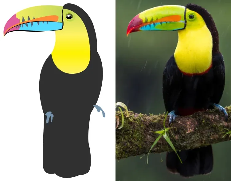
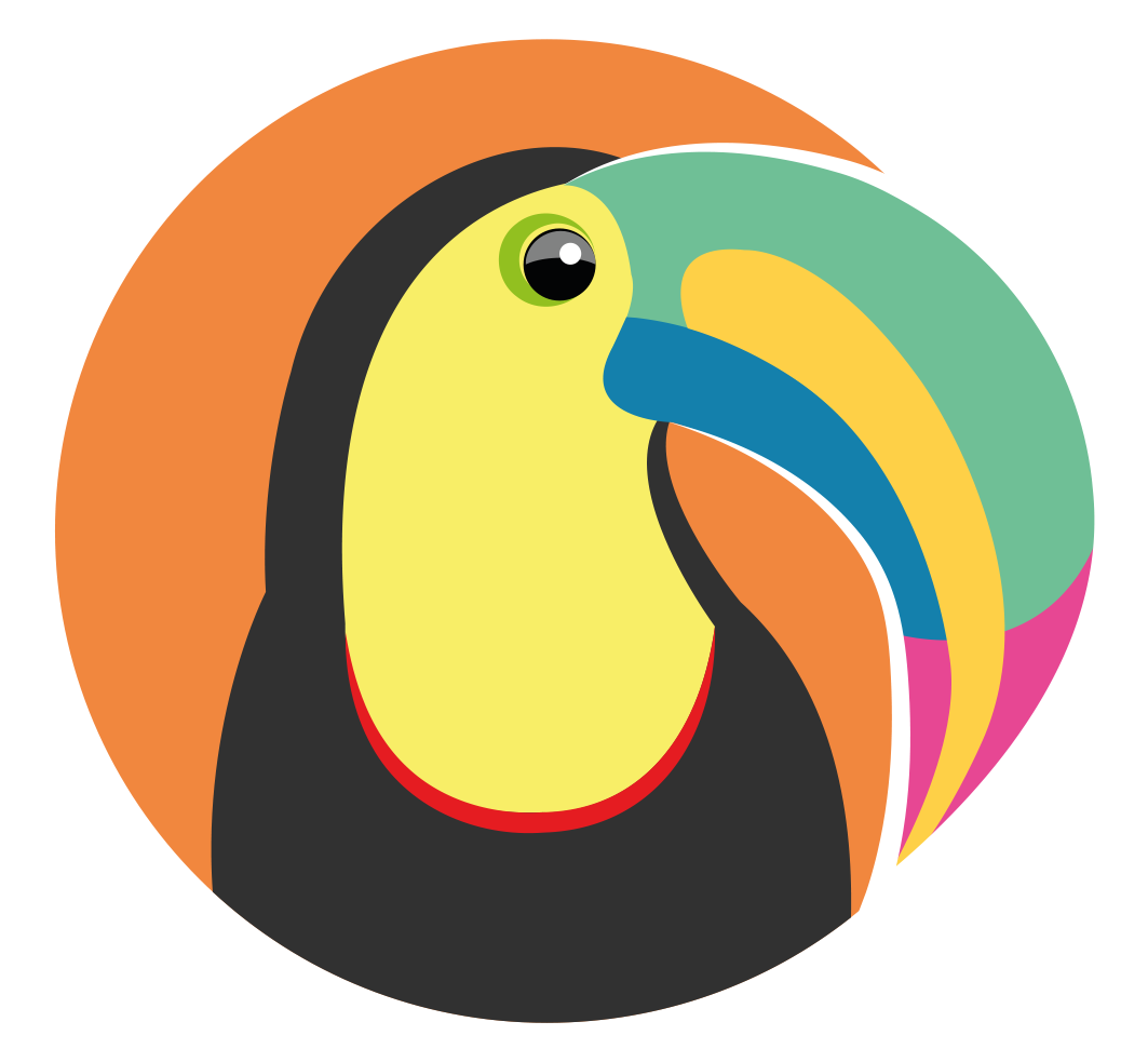
To build its identity, I started with a keel-billed toucan, a less common and much more colourful species than the toco toucan. It offered a distinctive visual direction while echoing the software's original purpose: creating and printing visual communication materials.
Simplify without losing character
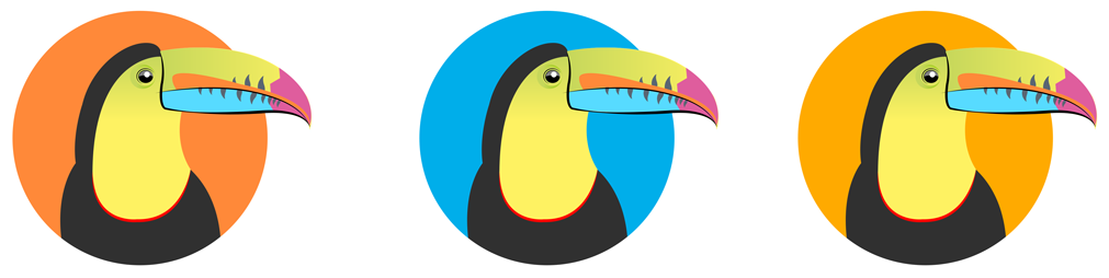
The first version felt too harsh: the beak shape could read almost like a jaw. I simplified and curved it further to create a softer silhouette that also worked better at icon size.
Bringing the identity into the product
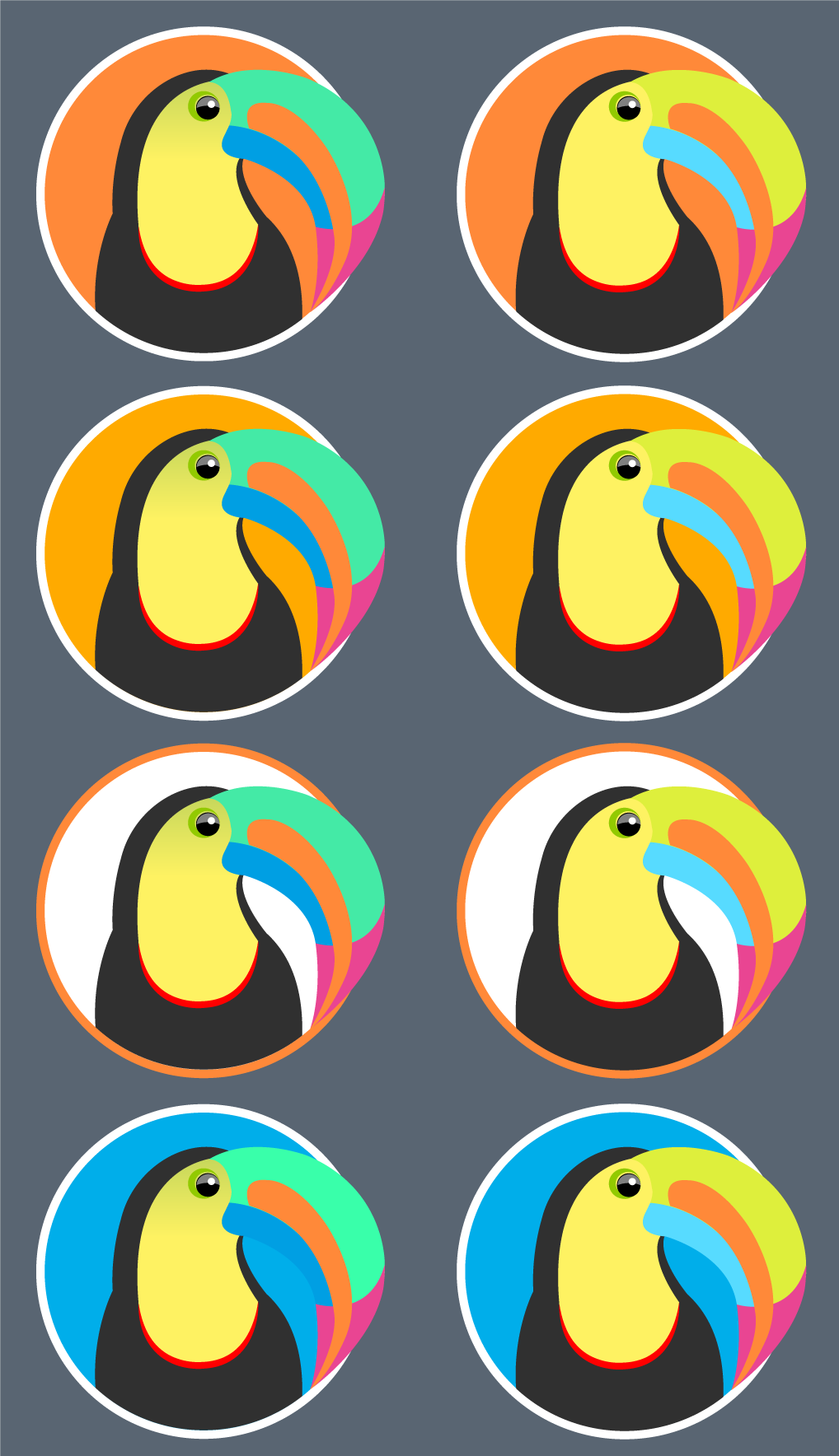
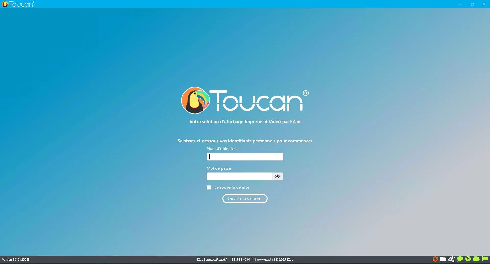
Colours, light and dark background variations, and greyscale legibility were tested before finalising the identity. The lettering was also reworked to create a more distinctive wordmark.
02 — First interfaces
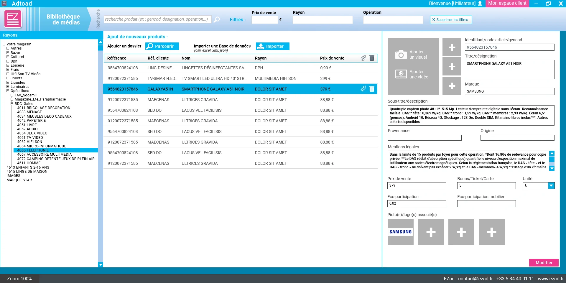
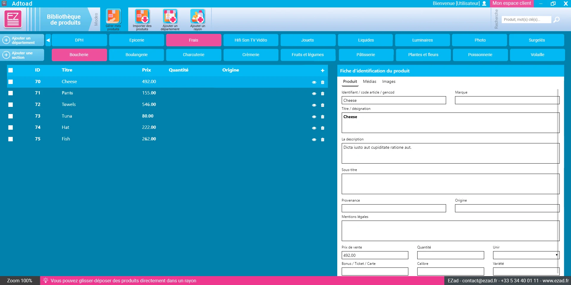
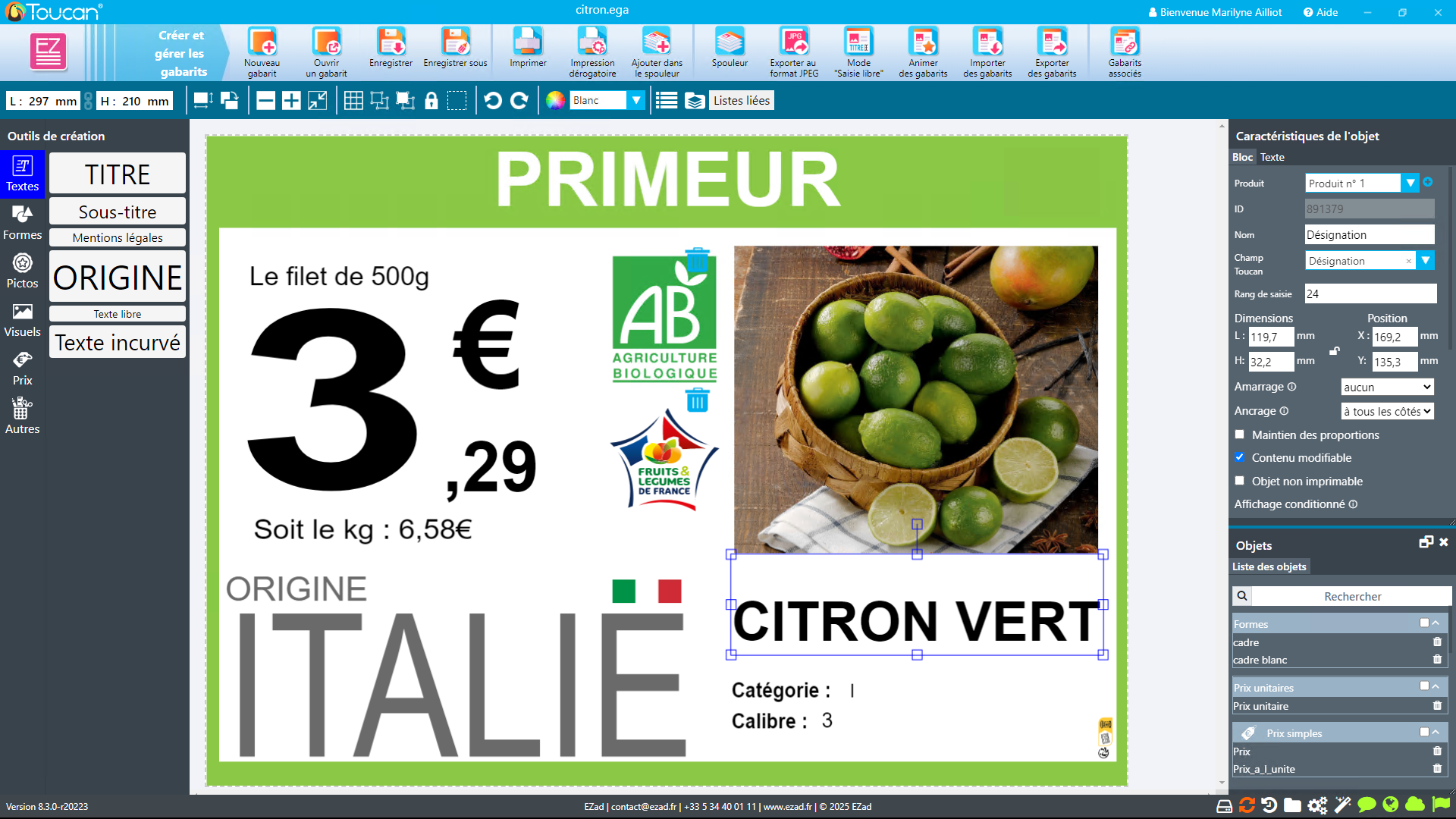
The first interfaces were designed around the functional foundations of the previous software. The aim was not to start from scratch: essential functions had to be preserved, their access modernised, and Toucan gradually expanded to support new use cases.
At that stage, I worked in Adobe Illustrator. Mockups were presented to company leadership and the development team so that visual and usability choices could be tested against business and technical constraints before implementation.
Product library
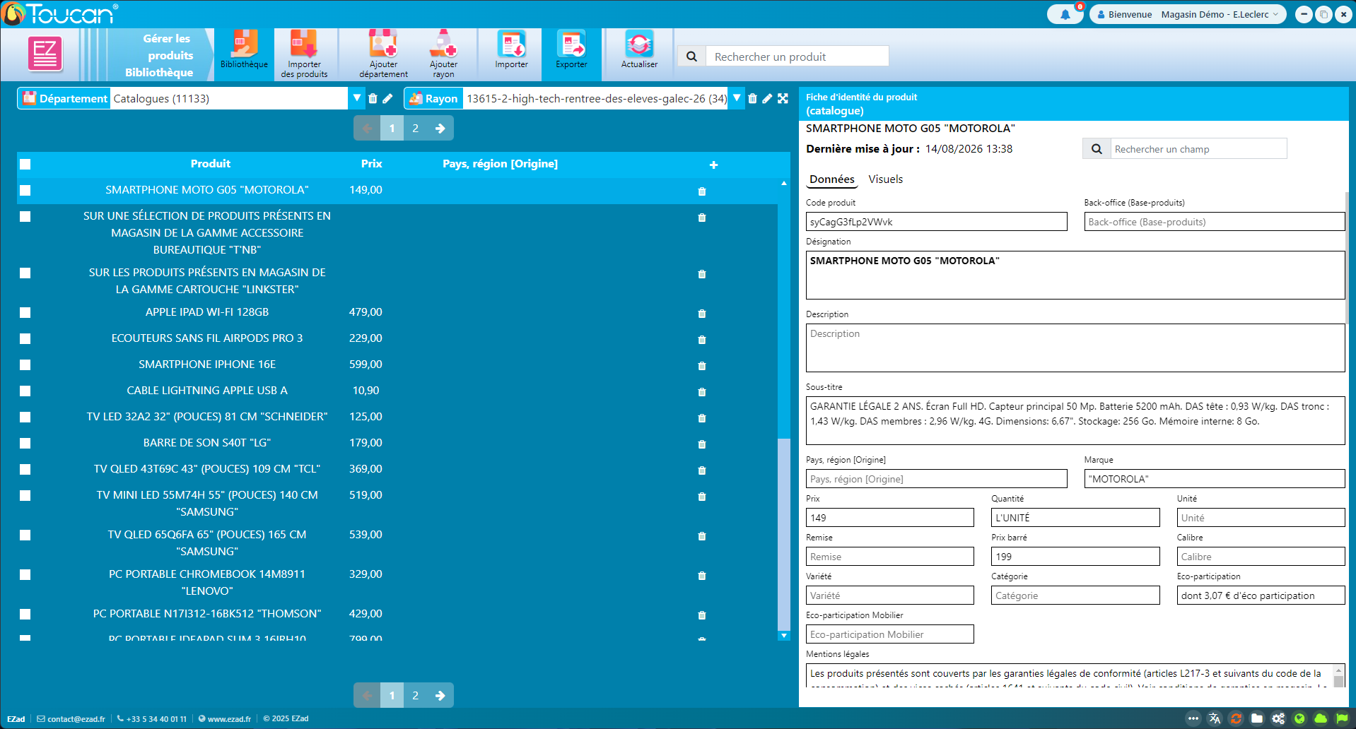
Interactive catalogues
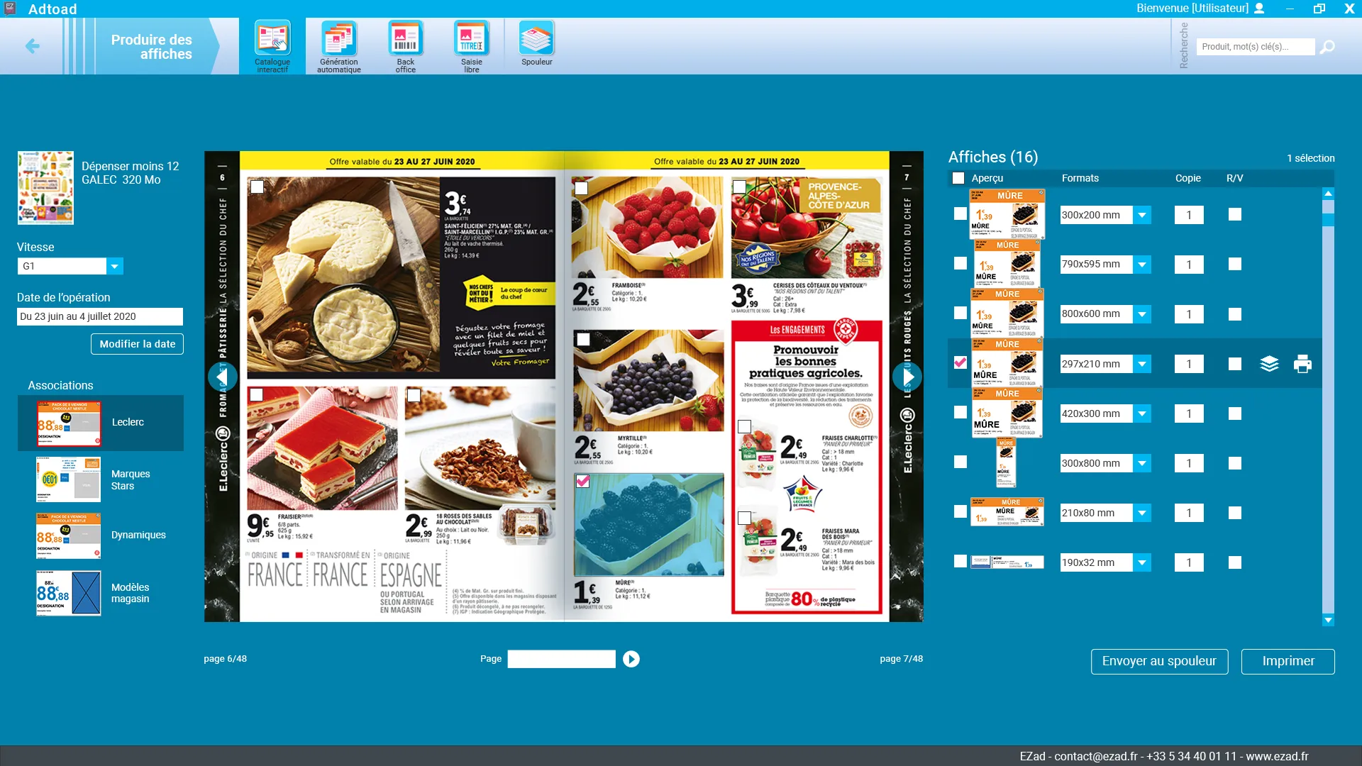
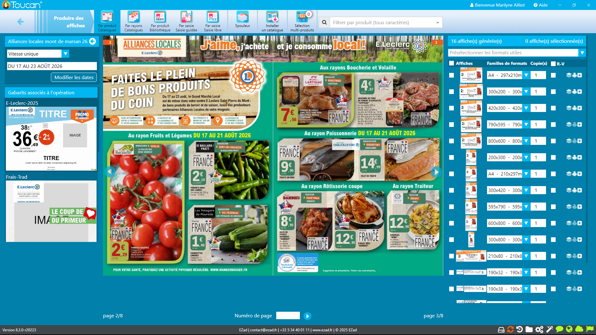
Poster generation from catalogues is one of Toucan's core workflows: a large amount of information needs to remain available without distracting users from the main task.
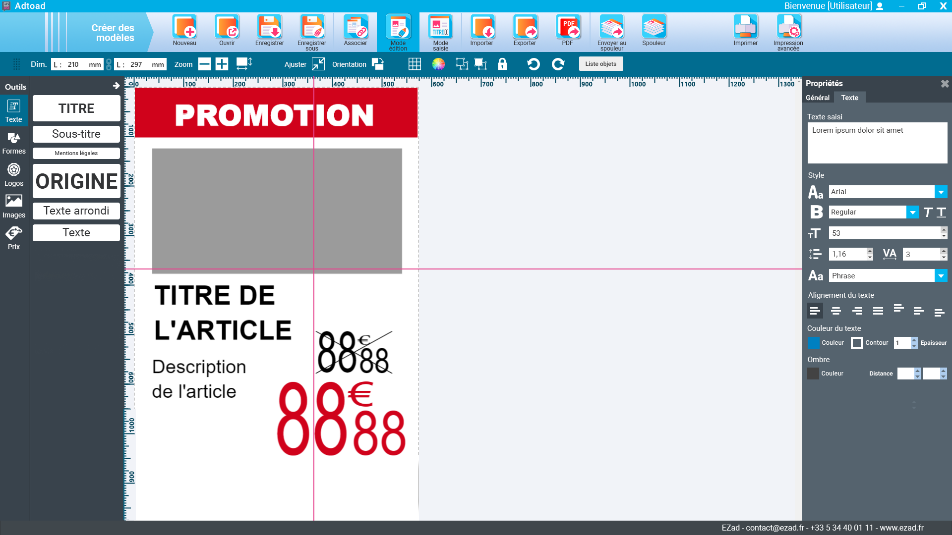
Creation tool
03 — Visual language
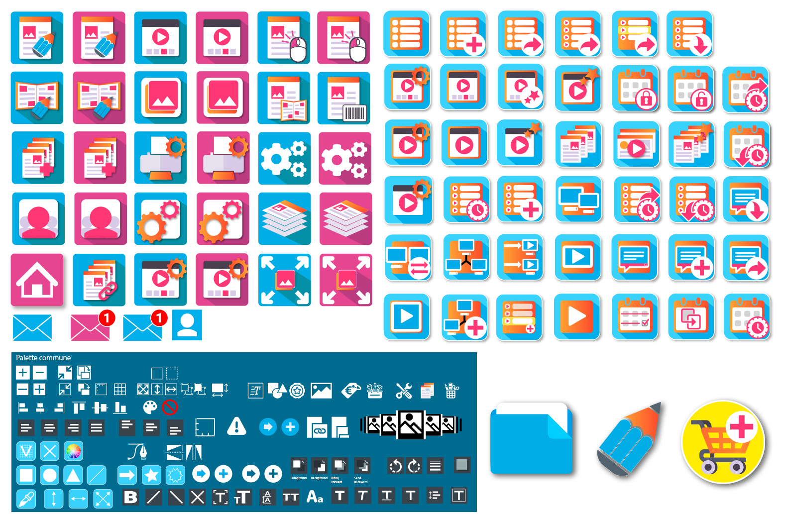
Toucan's functional depth required a coherent visual language. I progressively designed the icons used throughout its modules: poster generation, products, catalogues, creation, users, settings and video.
User research · voice of the customer
The redesign is not based solely on internal requests or interface decisions. I designed a seven-step customer questionnaire to better understand how Toucan® is used, measure satisfaction and identify where users want greater simplicity or autonomy.
The questionnaire combines respondent profiles, frequency of use, functions actually used, support needs and potential friction points across the software journey.
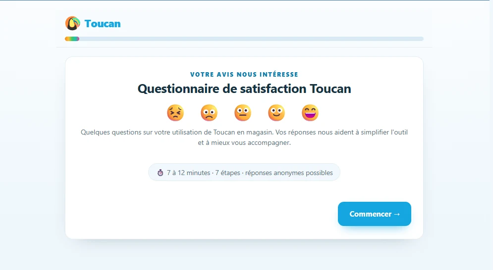
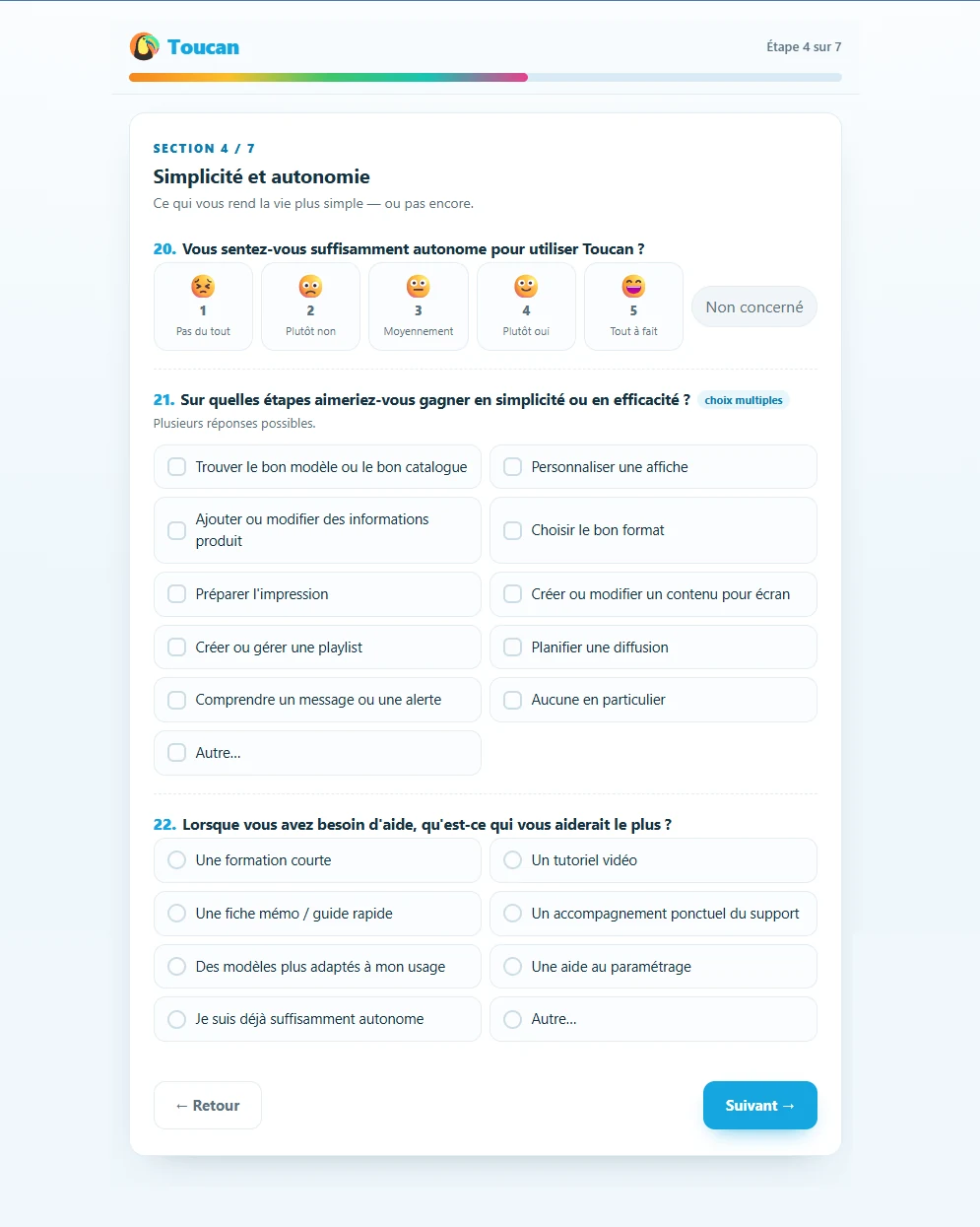
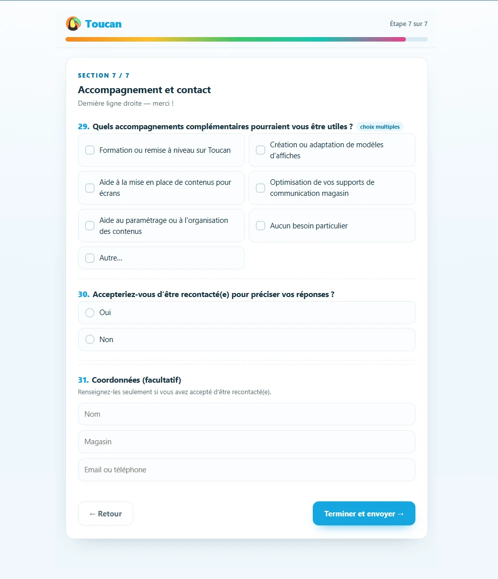
At this stage, the goal is to structure user feedback collection. Findings are only incorporated into the project once the response volume is sufficient to support meaningful analysis.
Product communications · video
Interfaces are only one part of the work. To present specific Toucan® features on social media, I also create short-form videos that translate software use cases into immediately understandable in-store situations.
The principle remains the same: start with the user need, establish the context, then introduce the feature at the point where it provides a concrete answer.
04 — An evolving product
Over the years, my role around Toucan has expanded. Training users, talking directly with customers and observing how the software is actually used provide another perspective on interface design: what works in a mockup also has to work in day-to-day use.
05 — 2026 redesign · Ongoing
In 2026, Toucan entered a new phase of development. The redesign aims to modernise and simplify the interfaces, make them more flexible for future web versions or new modules, and prepare the product for new features, including AI-powered capabilities.
I now work in Figma on information architecture, navigation, usability and the readability of the new interfaces.
Reduce visual density and create a clearer hierarchy between functions.
Design interfaces that can adapt to the web and future product developments.
Create the space required for new functions, including AI-powered features.
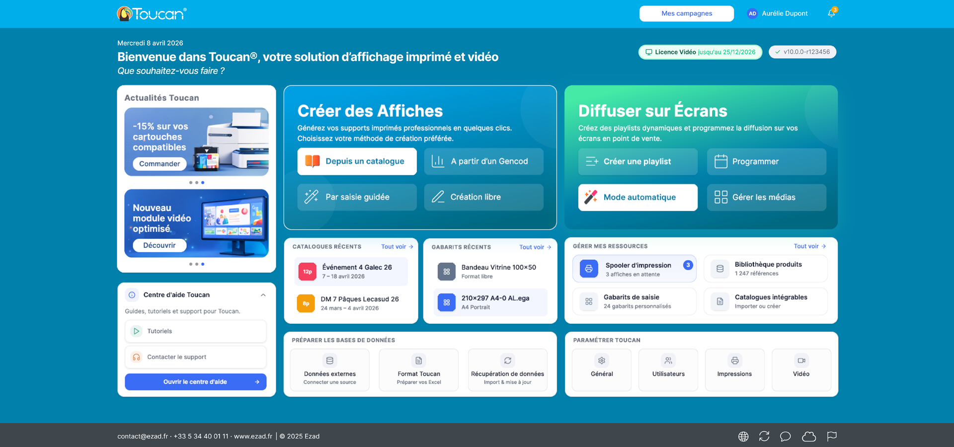
Before / after — homepage
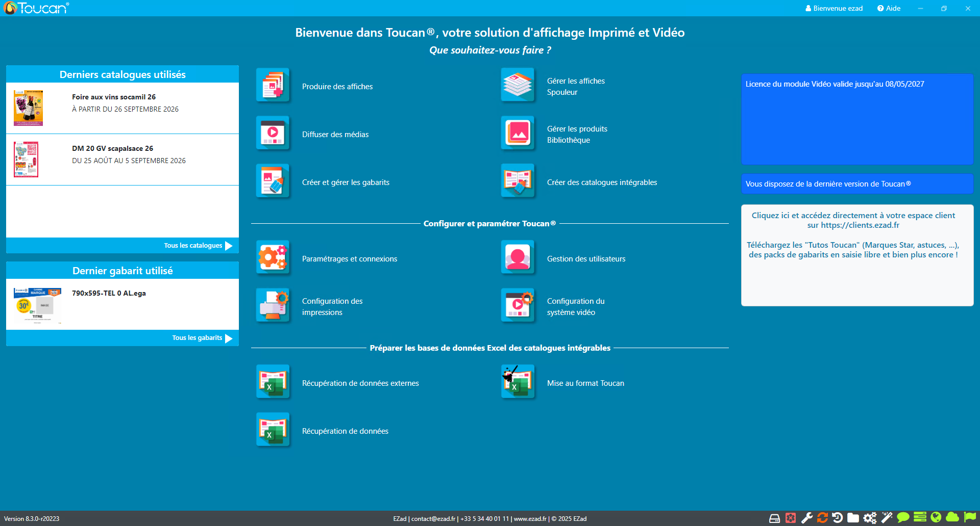
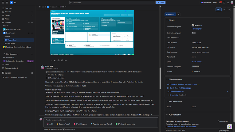
The new proposal recentres the homepage on Toucan's two primary use cases: creating posters and distributing content to screens. Settings remain accessible but are repositioned according to their role. A dedicated area can also surface news, new features or additional services.
Evolving the entry points
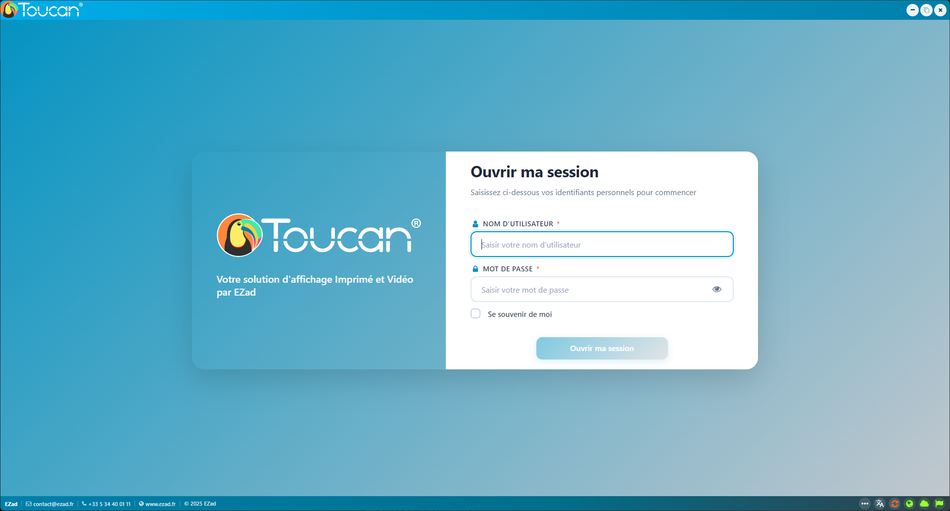
The new login screen modernises the entry into Toucan and makes better use of the available space, helping prepare the product for other versions or future modules.
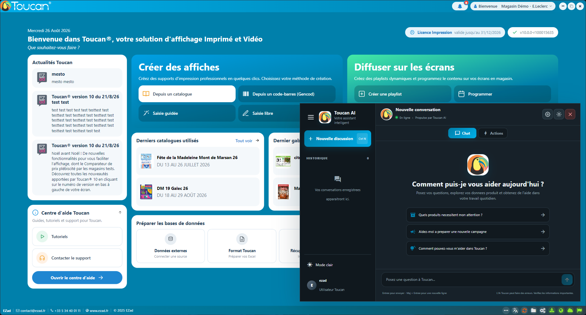
The redesign also introduces new types of interaction: I worked on the icon and visual integration of a conversational assistant directly within Toucan.
06 — From design to implementation
My mockups are handed directly to developers, together with explanations of the objectives, expected behaviours and usability decisions behind them. After implementation, I also carry out functional testing to check how the screens behave in practice and identify any adjustments that need to be made.
07 — Ongoing project
The Toucan redesign is still at an early stage. The first screens establish the principles of a new experience that will gradually be extended across the product's different modules.
The challenge is not to redraw the existing software exactly as it is, but to evolve a feature-rich business application without losing what makes it effective for its users.
What this project demonstrates