Restructure the offer
Rethink the information architecture, distinguish products, solutions and services, and create more direct journeys based on customer needs.
Case study 01 · Website
Redesigning a B2B website that had become difficult to navigate and understand, with a clearer offer, stronger connections to real customer use cases and improved organic visibility.
View the live website ↗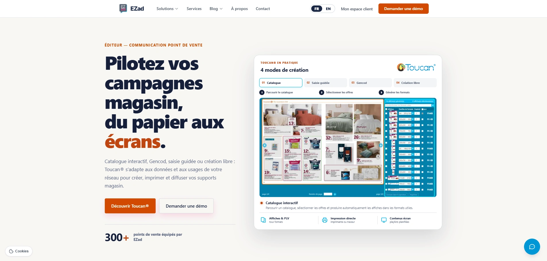
Starting point
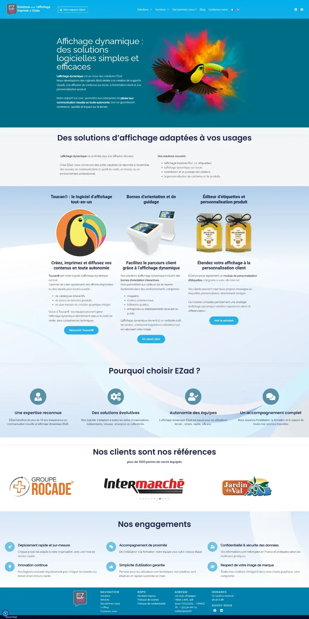
EZad's offer had evolved, but the website was still built around a broad presentation of “display solutions”. Products, services and use cases were difficult to prioritise, and visitors could not always understand quickly what the company could actually bring to a retail network or an individual store.
The redesign therefore had to go beyond visual changes. The main challenge was to rethink the structure, messaging and user journeys around customer needs, then make the different solutions easier to understand.
Brand identity · 2017
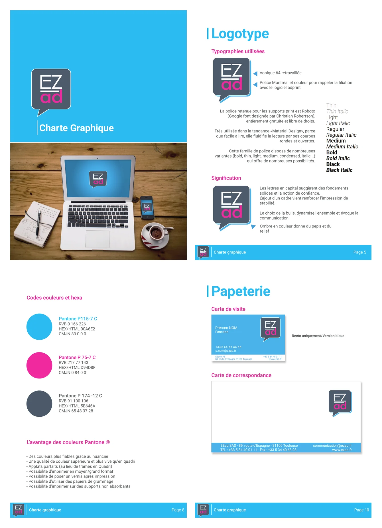
In 2017, I designed the EZad logo and created the company’s brand guidelines. The goal was to modernise the company’s image without breaking away from the visual heritage of its existing software products, while establishing a stronger, more dynamic and immediately recognisable identity.
I formalised the rules governing the logo — variants, clear space, use on different backgrounds and incorrect applications — as well as typography, Pantone / RGB / HEX colour specifications and the main print and web applications.
Applications · office environment
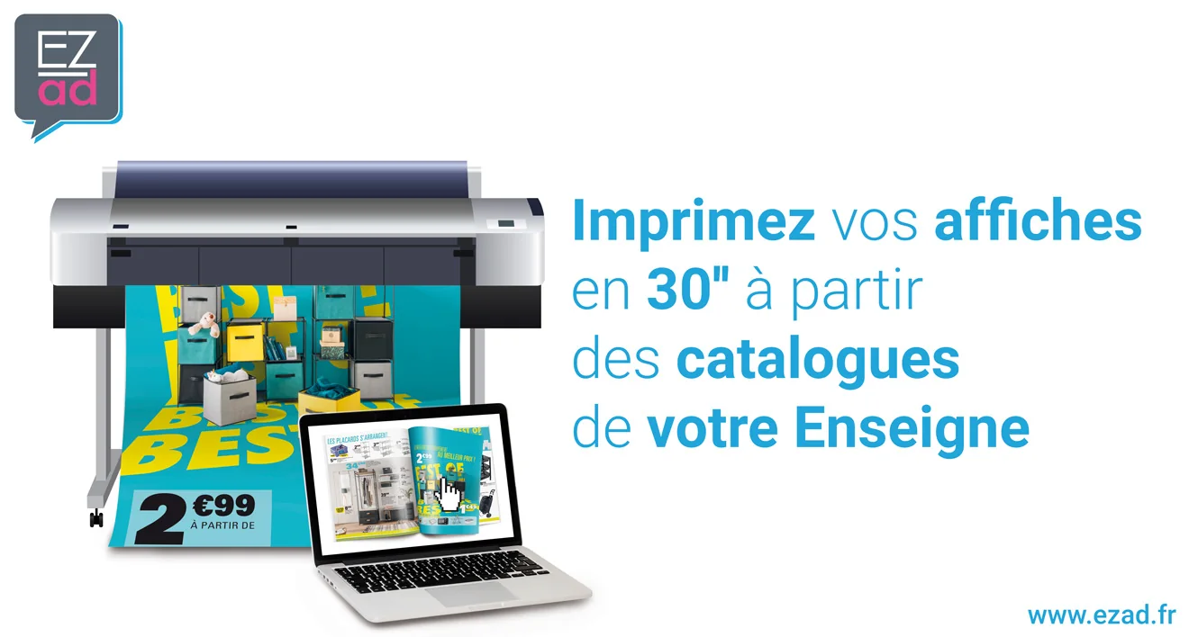
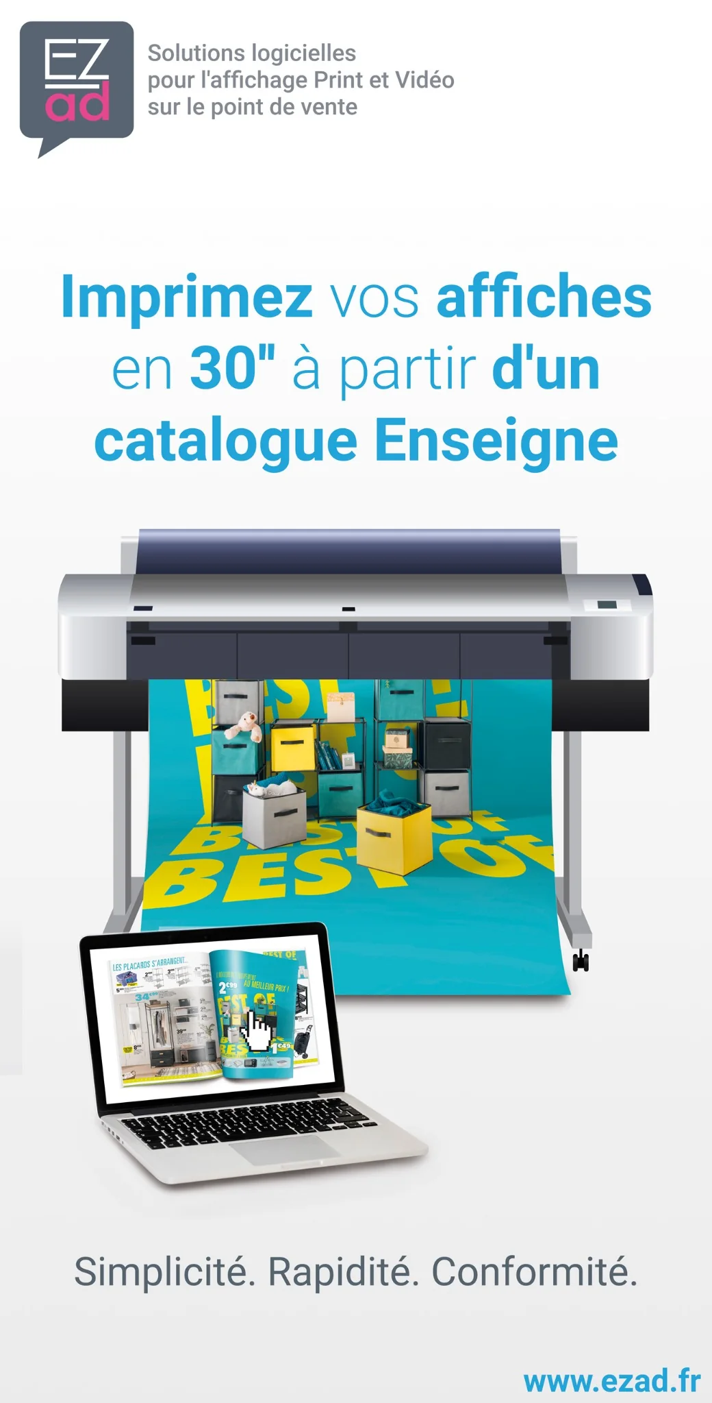
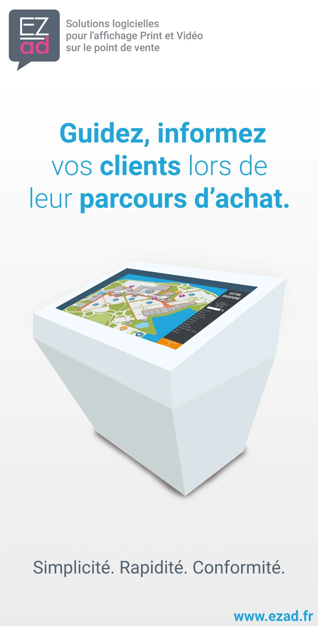
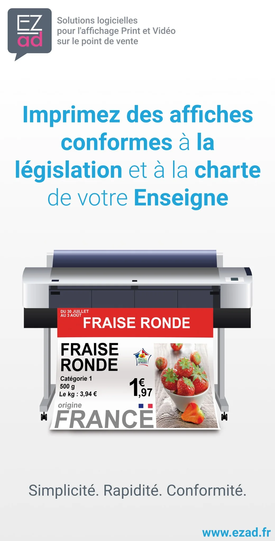
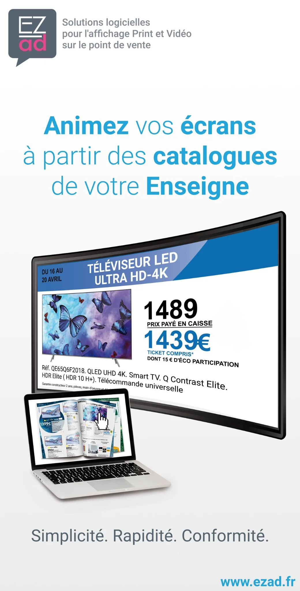
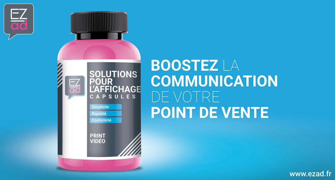
I then applied the identity to a series of posters designed to dress the EZad offices. They highlighted the main promises of the offer — simplicity, speed and compliance — through concrete use cases such as catalogue-based poster printing, compliant in-store communication, digital signage and interactive kiosks.
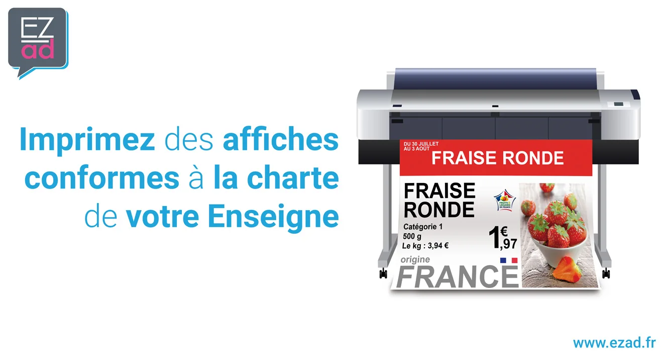
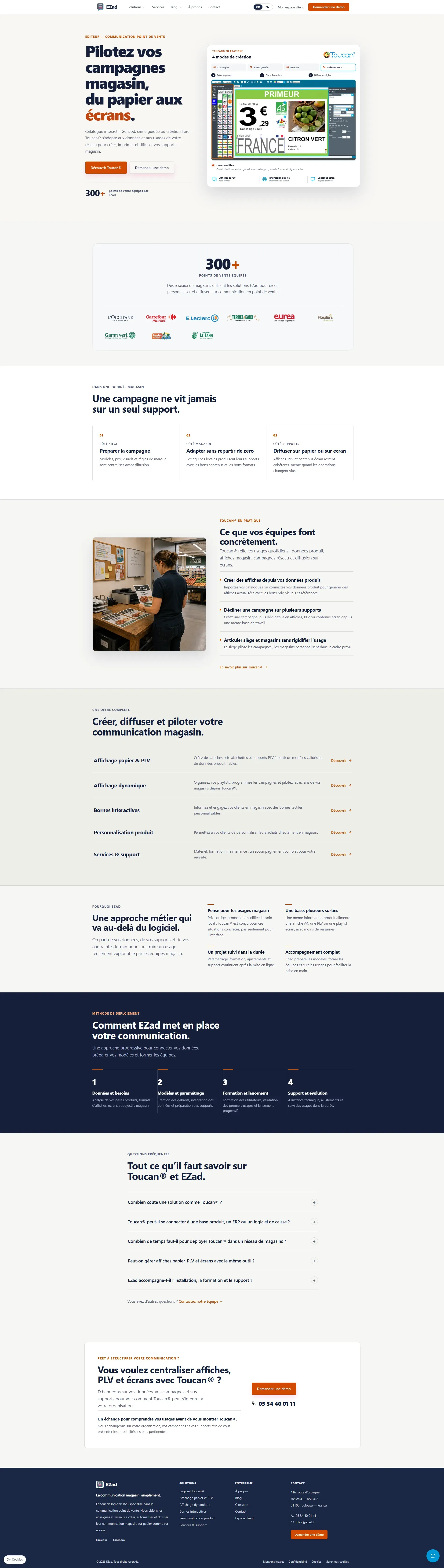
Before / after
Approach
Rethink the information architecture, distinguish products, solutions and services, and create more direct journeys based on customer needs.
Start with real-world use cases and customer benefits rather than a list of technical features.
Define page structures and content hierarchy in Figma, then adapt the experience for both desktop and mobile.
Track indexing, search queries, impressions and technical performance after launch.

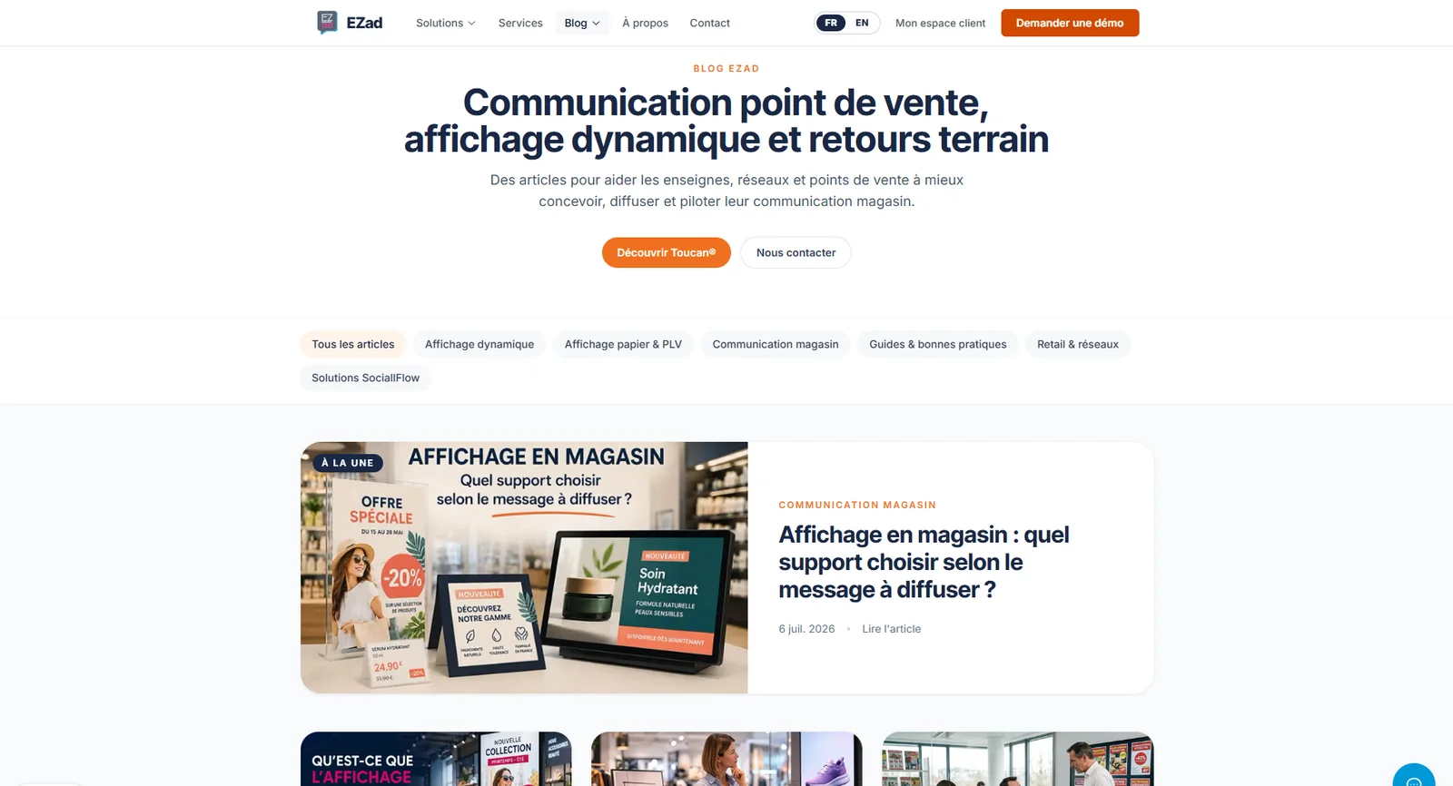
Clearer content architecture
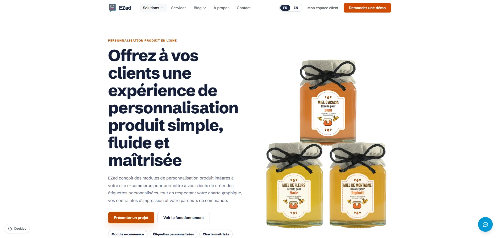
The new structure gives each offer a clearer reading path: customer benefit first, then how the solution works, followed by the useful details. Solution pages are easier to scan, while the blog becomes an entry point into the company's expertise and real business challenges rather than simply a news section.
Responsive & international
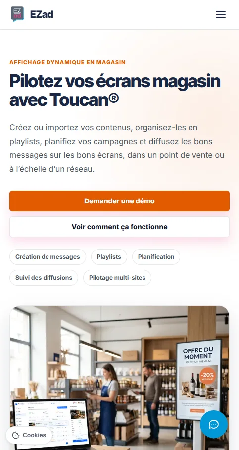
Pages were designed to remain easy to read on mobile, with tighter hierarchy, visible calls to action and content blocks that retain their logic rather than simply stacking the desktop layout.
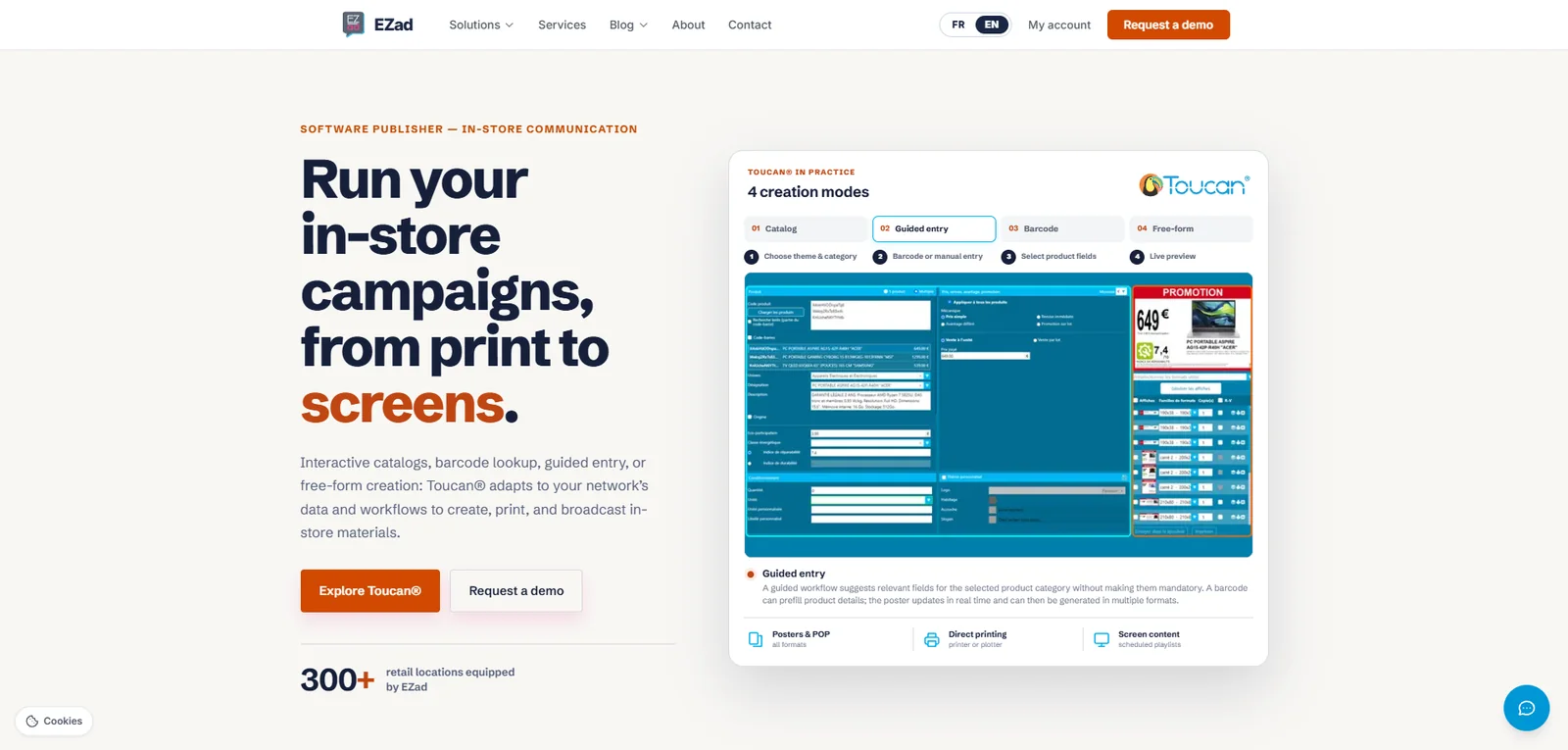
The website is also available in English, with adapted content rather than a literal duplication of the French pages.
Launch & user experience
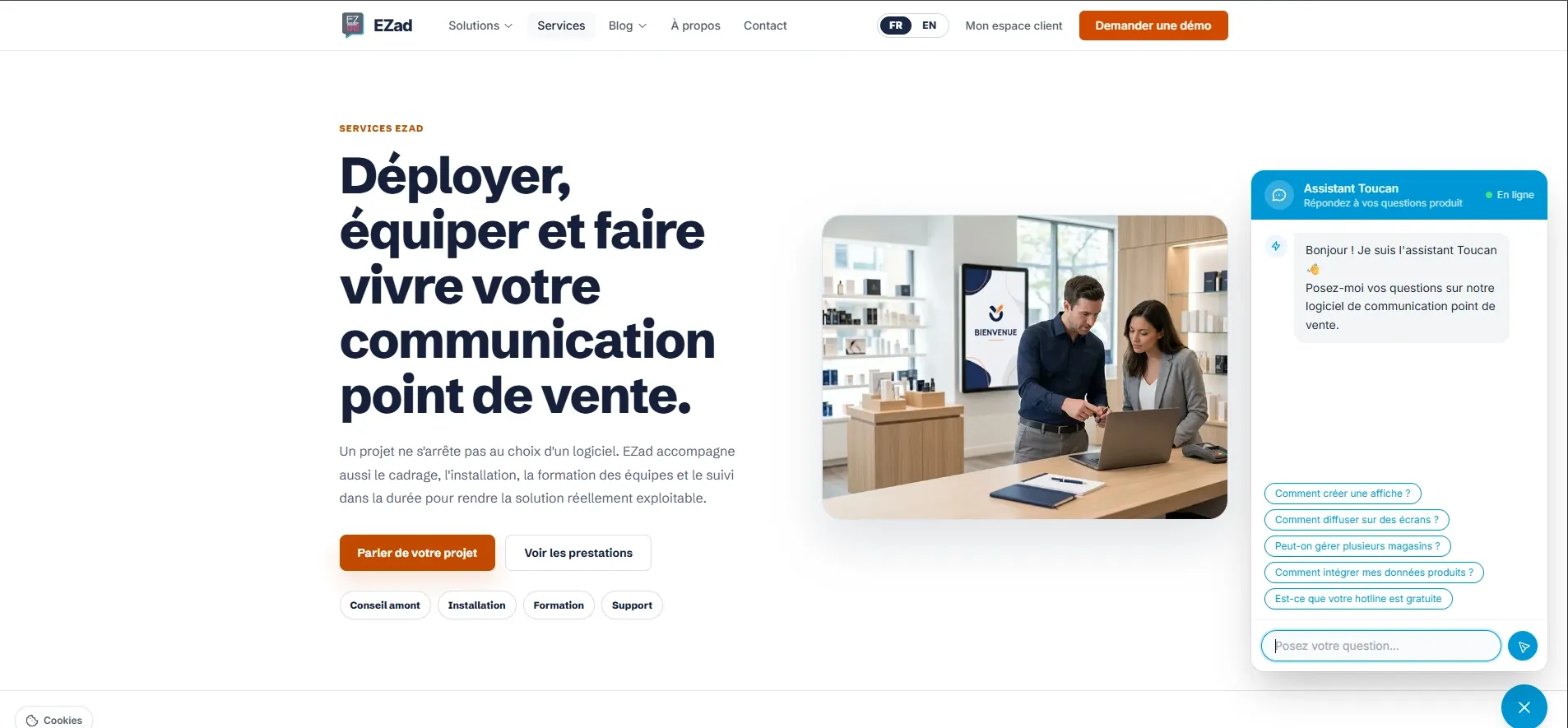
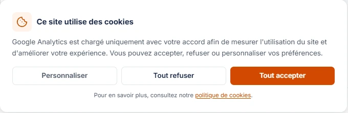
Launching the new website was also an opportunity to improve the overall experience and make measurement more reliable: easier access to product information through a conversational assistant, combined with consent management before analytics tools are triggered.
Results
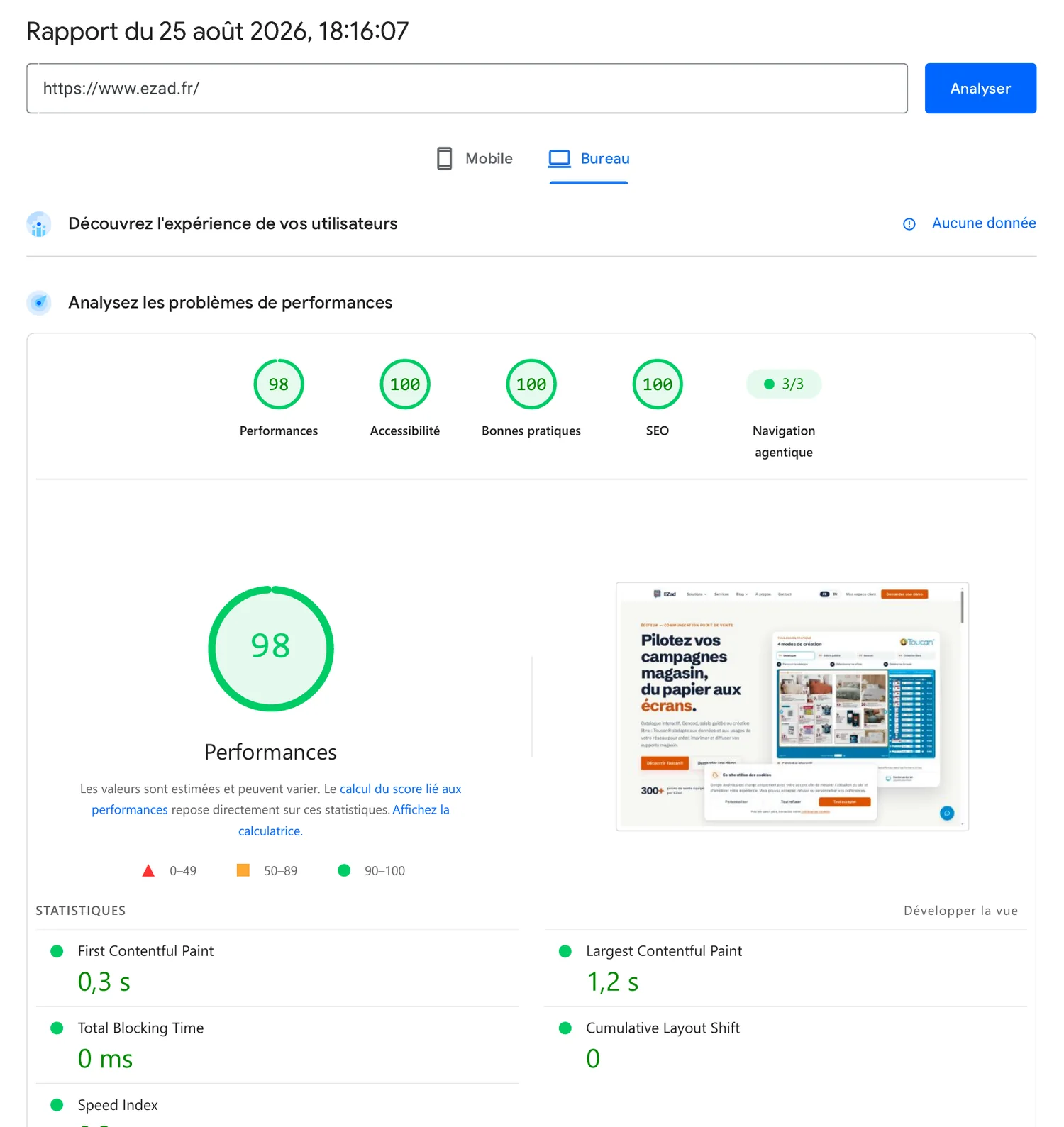
Sources: Google Search Console and PageSpeed Insights. Data reviewed on August 25, 2026.
What this project demonstrates
This project reflects the way I work: understand a complex offer, identify what needs clarification, structure the message and user journey, then measure the results and keep improving the experience.